Spotify 02
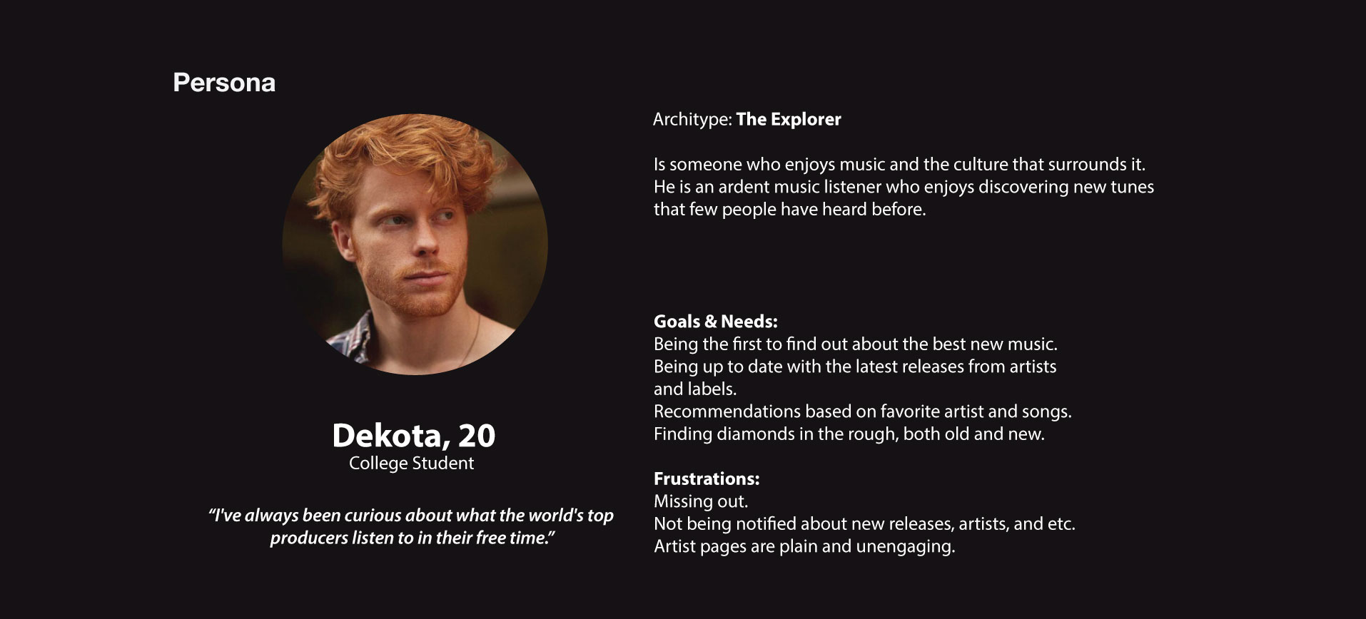
Spotify, is a leading music streaming platform that gives users access to millions of tracks and producers worldwide. The objective was to focus on the user and to identify existing concerns. Then apply that knowledge to clean up Spotify's Interface. Enhancing the layout and organization to cover several user pains.
The why and how behind the changes.
In order to better understand the present condition of the platforms before starting the redesign I looked at demographics, user data and trends, as well as prior company interface redesigns.
I prepared a poll after investigating Spotify to collect input from active users of the services.
Framing the problem.
The weight and thickness of strokes were too thin
Wanted to revisit the weight of icons and typeface(s).
Icons. Icons. Icons.
Create a new set that could accommodate, making things more consistent and easier to manage.
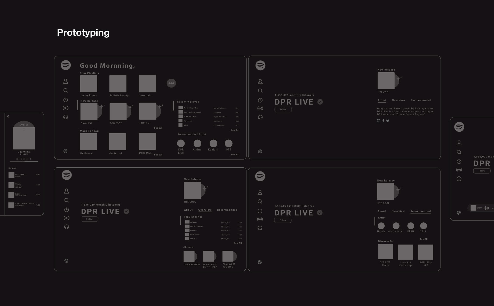
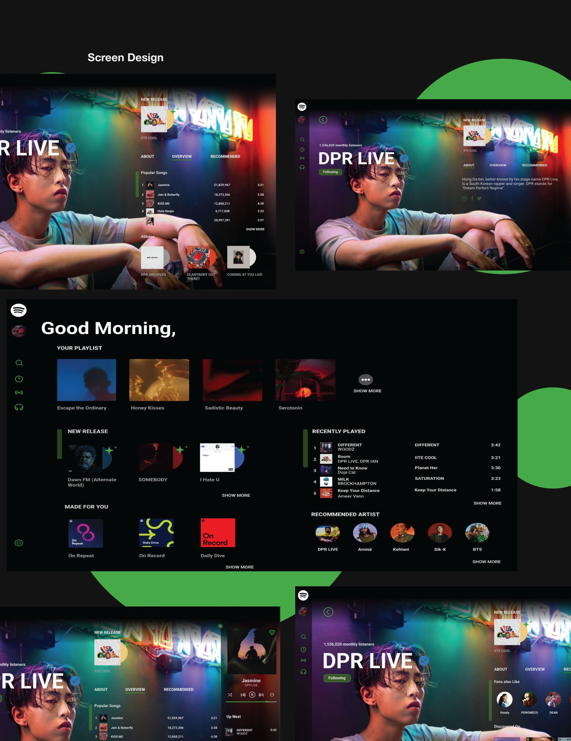
Enabling a seamless transition for everyone
Users wanted a seamless transition for end-users. Open yet organize layout designs.